
In a world saturated with visual noise, and humans with an attention span said to be shorter than a goldfish’s, we only have a split-second in which to gain someone’s attention, and more importantly, a mere few seconds to keep it. One of the best ways in which to grab readers attention is to use infographics.
Putting something into words is often not the best way of relaying information to an audience, as getting people to read large amounts of copy is incredibly difficult, unless you tie them to a chair, secure their head in a fixed position, and prise their eyes open with matchsticks. But enough about my weekend antics. Information is beautiful celebrates the best in representing data visually, through the use of infographics. Displaying data in this way can appeal to a wider audience, as it’s much more instantly engaging, and easier to understand.
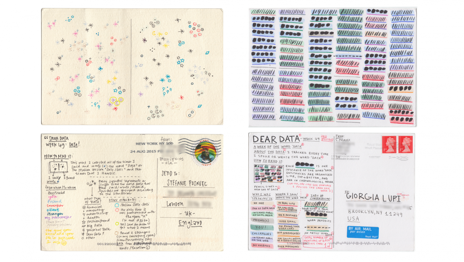
Visualising data come in all shapes and sizes; from a heat map showing how infectious diseases declined drastically after the introduction of the vaccine by Dov Friedman and Tynan Debold at The Wall Street Journal, to the conversation between two friends Giorgia Lupi and Stefanie Posavec, on either sides of the world, visualising how a typical day was spend and beautifully scribbled into a postcard.
These are just two examples of particular pieces that were awarded recently at the Information is Beautiful Awards 2015. Of course, infographics and data visualisations are not always the ideal solution; words still suffice in the right situation.
And so, if you’ve taken the time to read all of my 257 words within this article, then I sincerely thank-you for your patience!