As we ease ourselves into a new working chapter we’ve taken some time out to reflect on the latest trends that are really rocking our design world. See below for the greatest, latest thoughts of Underscore’s sizzling design talent…
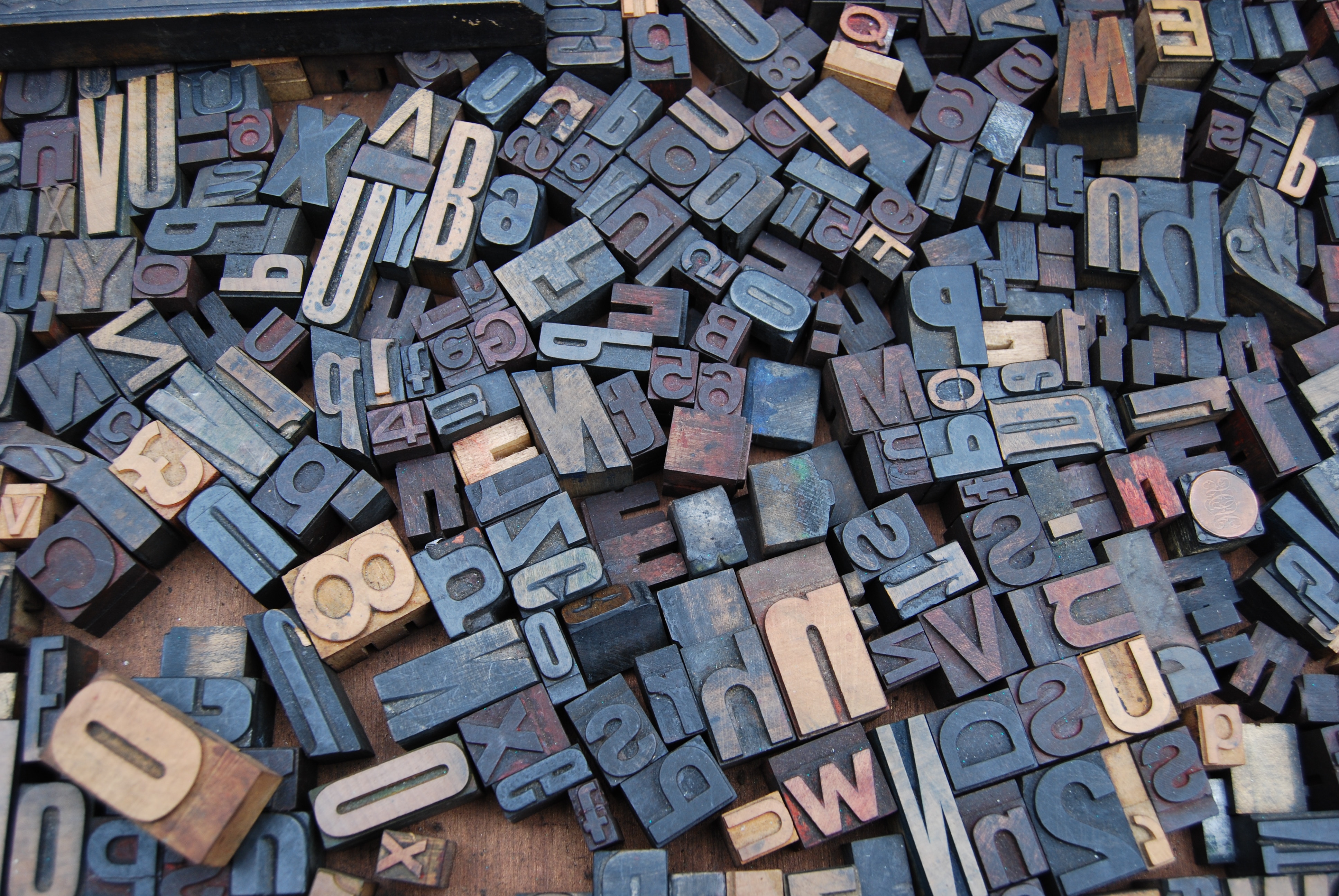
There’s a new serif in town
Like acid house revivals, serifs seem to come in and out of fashion every 5 years or so, developing fresh new forms each time around. They’ve had a difficult time since the birth of the web, as their nuances render badly on lo-res monitors, but with retina screens becoming standard, these aliasing problems are consigned to the past. We’re characteristically slightly skeptical of these trends, as they can tend to look dated after a couple of years. However, while old workhorses like Bodoni will always have their place, we’ve spotted some serifs that genuinely breathe new life into the form. The Southbank’s recent rebrand uses a custom slab at the centre of its identity that’s established itself in the public consciousness so quickly that it’s tricky to remember how they looked before. The Guardian’s new masthead initially had a mixed reception, replacing Commercial Type’s much loved Guardian Egyptian, but its introduction was a brave move and signalled their downsize from broadsheet to Berliner format.

Believe in brutal
Brutalism is having a moment. Inspired by the post-war architectural style that boomed from the 1950s to the mid 70s, we’re seeing the same stark style infiltrating graphic design. Brutalist buildings assault their surroundings with imposing angular geometric shapes and arresting concrete mass. For years these monolithic buildings have been heralded as eyesores, but recently attitudes are shifting, with many buildings becoming listed and finding themselves suddenly the object of public affection.
By no means is this a subtle design technique though. Like the architectural movement, shunning traditional notions and placing emphasis on materials and texture, we’re seeing design with prominent, bold typography, less precious hierarchy and spacing, overlapping elements and generally a sucker punch to the chops that shows the aesthetic doesn’t need to be polished to make an impact.
Being such a severe style, people are going to either love it or hate it. For Brutalism to work and have longevity, rather than simply falling back out of fashion, it needs to be pushed forward and given a modern twist. A softer approach is going to have to be applied to make it more mainstream and accessible. This is particularly true when it comes to web, as although this bold graphic style may appear fun and quirky to begin with, it can very quickly become overwhelming and lose that emotional connection. Through the softening of edges, the application of gradients and the tempering of angles we think Brutalism could have real staying power.
Death to stock
Stock imagery and its accessibility cast a dark shadow over custom graphics a few years ago, but we’ve recently noticed custom illustration is creeping its way back into our hearts.
Whether it’s a playful animation for a loading screen or an illustrative infographic, a brand can position itself with a distinctive style, giving content complete own-ability. Adding to the visual language suite, this use of illustration and custom graphics can really capture a brand’s personality and enhance their tone of voice. After all, isn’t that what most of us strive for – an individual point of view?
Artistic, practical or purely decorative, a more illustrative approach will hopefully flourish throughout 2018.
Colours are going big
Design needs to work across every platform and digital and flat designs really sing when mixed with bold colours. As a designer it’s easy to apply these vivid tones, making the brands and their content stand out more in today’s fast-paced millennial market.
Along with bold colours, gradients are also making a huge comeback and are no longer reserved for dodgy PowerPoint presentations. This trend began and solidified a few years ago, after industry leaders like Spotify and Instagram decided to change their logos and palette from flat colour to multi-colour transitions. Semi-flat design is predicted to be one of the biggest graphic design trends of this year. Semi-flat design, or ‘flat 2.0’, combines the best qualities of the flat design movement, with additional cues like gradients and shadows to improve aesthetics and enhance the user experience.
From logos to picture overlays, the gradient trend is everywhere and suits forward-thinking brands. As this trend develops, we will discover more gradient innovations, particularly with the use of bright and vivid colours in combination with a variety of textures.

Less is not more
Lately we’ve noticed a torrent of oversimplified websites, leaving them looking bland and feeling like a template. Although we’re all for minimalism, it feels like a lot of companies are going for a generic look purely because simplicity is in vogue, rather than it matching up with their brand or service offer. In many cases, this simplistic style takes away from the soul of the site. While we think it’s important for a website to have a flawless user experience and a digestible amount of information, it should still be given some love through the details and brand elements that could be pulled through in the design.
Move it or lose it
The attention span of our audience is dwindling with today’s fast paced digital content, particularly amongst the youth demographic. With digital content there is a very short window in which to engage your audience, and this is where motion becomes an integral part of getting a design noticed. The natural and fluid movements of motion allow designs to come to life in front of the user, engaging them with a unique experience and leaving them wanting more. Motion can allow the user to see the journey of the design, with playful techniques bringing personality to a brand. It’s always important to have a strong balance of design and motion, but for audience engagement motion is a no brainer.
Masters of the mock ups
A key challenge in our world is how to showcase your best design and show the world what you’re really made of. We’ve noticed a rise in extremely high quality and interesting mock ups, allowing a designer to show their work living in the real world, rather than as a flat and lifeless visual. One amazing resource we’ve found for sourcing such mock ups is Anthony Boyd Graphics, who creates stylish and slick images that really pack a punch when visualised with cutting edge design work. You can check them out here: https://www.anthonyboyd.graphics/
To find out how our crack team of designers could help bring your brand to life, contact us at hello@underscore.co.uk
