
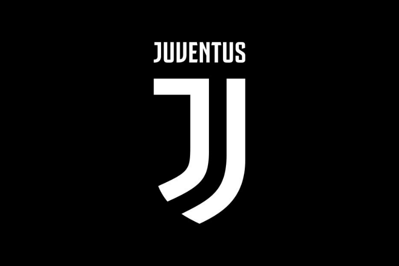
Last week, when iconic Italian football club Juventus revealed their bold new logo, it was met with equal parts praise and derision. Many felt it was stepping on a century of tradition. Others saw a clean, stylish and savvy step forward. Regardless of your own feelings on the new crest, it’s undeniable that the rebrand represents what could be a bold new direction for sports branding in general.
Revealed by way of an utterly ridiculous and hyperbolic launch video, it’s no surprise that many fans were more than a little uncomfortable with the new Juventus identity.
Football fans and pundits alike reacted with incredulity, arguing that that Italian football’s ‘Old Lady’, with 110 years of history behind her, was not the right place for a minimalist, typography-led logo. It represents the first time since 1931 that the iconic charging bull has been absent, and the even more iconic black and white stripes have now been reduced to negative space within the ‘J’.
If it was going to be so obviously divisive, why did Juventus take the leap? As football journalist and Twitter user Cristian Nyari points out, it isn’t hard to see for yourself:
You be the judge…look at how Juventus’ new sleek logo stands out amidst an array of outdated, archaic crests. pic.twitter.com/nLuk5uzWQ0
— Cristian Nyari (@Cnyari) 18 January 2017
Minimal it may be, but the new identity manages to stand out against a sea of dull, outdated and thoroughly unmemorable crests. Why does this matter?
Because these days, football clubs are more than just sports teams. They are international brands, commanding religious followings across the globe and netting eye watering revenues. On the same day that Juventus’s new crest was unveiled, Deloitte revealed annual revenue of €689 million for English club Manchester United. Juventus themselves came tenth in Deloitte’s alternative league table, netting a tidy €341.1 million themselves.

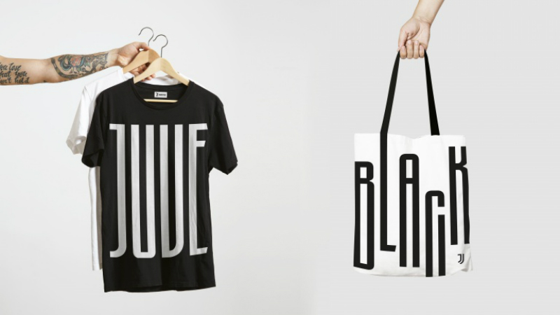
To maintain and grow these international followings, sports brands need to be both recognisable and relatable. Social media is now king, so sports branding also needs to take into account shareability. Brands also need to be highly adaptable to work across numerous promotional materials. The Italian giants’ new identity might not appease traditionalists, but it certainly meets all these criteria. It will allow Juventus to own a stylish, simplistic and shareable monogram in a way that almost no other sports team can.
Love it or loath it, Juventus’s new crest is certainly both eye-catching and memorable. In a world where sports brands are more lucrative than ever, making such a bold statement could well prove to be a masterstroke by the Italian club.
(Credit all images: Juventus F.C.)