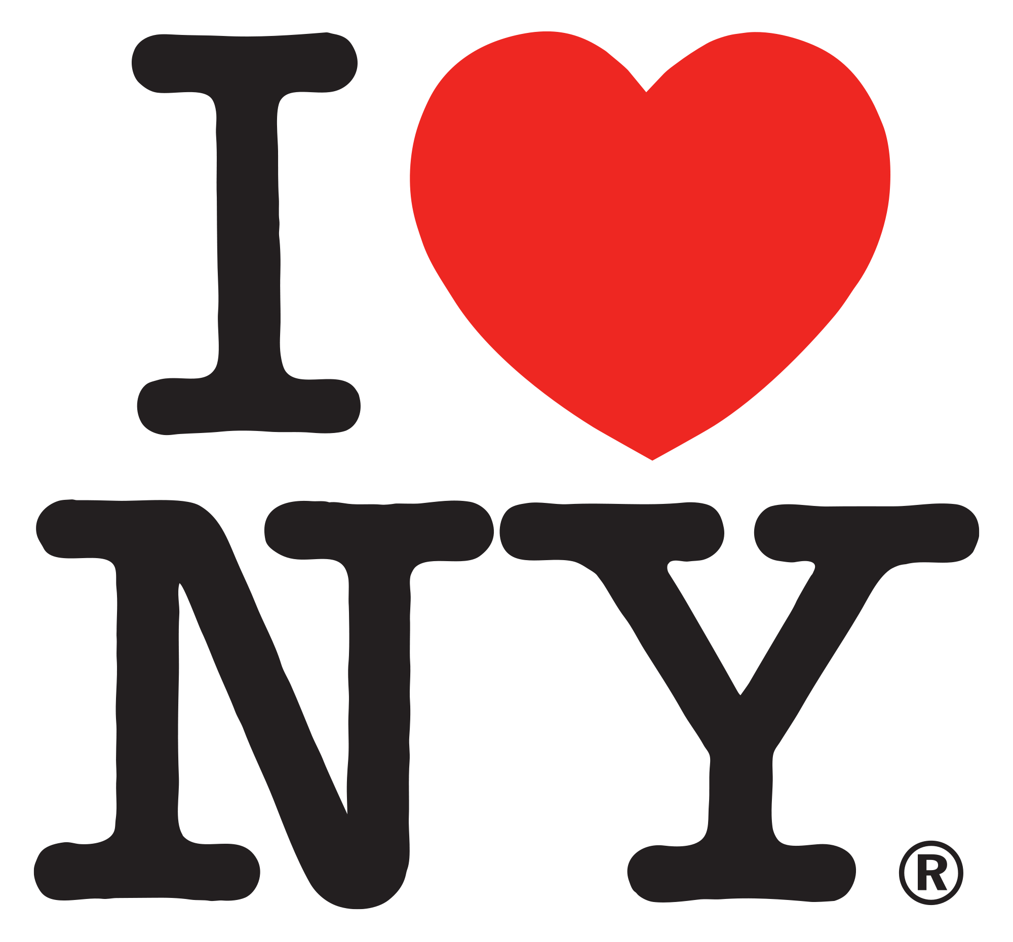
In 1976 New York was on the verge of bankruptcy. With a billion-dollar deficit, the streets were a crime hot-bed, and an uncertain, unsafe mist stagnated over the city. Desperate to increase tourism and transform the city’s grim image, the New York State Department of Economic Development hired the ad agency ‘Wells Rich Greene’, who in-turn hired graphic designer Milton Glaser to develop a marketing campaign for New York State. Born from an idea he had sparked a week previously, in the back of a taxicab, with a red crayon and a torn envelope, Milton Glaser sketched a logo that would later become central to the creation of modern New York. As we approach the 40th anniversary of it’s creation, Underscore celebrates Glaser’s ‘I Love NY’ logo, an emblem which helped change the city’s fortunes and became one of the most recognisable emblems ever created.
The original marked envelope and subsequent concept boards are now a permanent collection feature at the Museum of Modern Art, where senior curator of Architecture and Design Paolo Antonelli proclaims: “I consider it to be the first emoji… It is universal and joyful, irresistibly so, and it is flexible; it can be used to show love for a megalopolis or for Vegemite.” Perhaps to the first modern ‘meme’, a term coincidentally coined the same year as Glaser’s cab ride by Richard Dawkins.

Later suggesting that he may have been subliminally influenced by Robert Indiana’s LOVE pop art image, Glaser’s innovative pop-style icon became a major success and continues to be so today. The logo represents New York State as a whole – from Long Island to Cooperstown, to the Hudson Valley, to Niagara Falls. But it is Manhattan where you feel it most. The image became especially prominent following the September 11 terrorist attacks on the city, which created a sense of unity among the populace. Many visitors to the city following the attacks purchased and wore the shirts bearing the I Love New York logo as a sign of their support. Glaser created a modified version to commemorate the attacks, reading “I Love NY More Than Ever”, with a little black spot on the heart symbolising the World Trade Centre site.
Glaser, who worked pro-bono as a freelancer in 1977, expected the ad campaign to last just three months, stating “the mystery of why certain things persist in the memory is irrational.” New York originally decided not to copyright the logo, but in 1994 Empire State Development began collecting licensing fees, earning the state millions. Merchandise branded with the logo earns more than $30m a year, none of which goes to Glaser. Modest in his demeanor, Glaser philosophises: “First, I have plenty of money. I am not a guy who’s suffering from a lack of money [sic]. Second, we all live to feel as though we have had some effect on others…and I get that demonstration all the time.”
 (Image credit: inc.com)
With a long and successful career and still practicing design to this day, with ‘I love NY’ Glaser believes that the form is often more significant than the message: “It’s a response to an abstraction – something about the nature of the confinement of those geometric shapes and the voluptuousness of the heart. Art is about touching those parts of the brain that have an emotional response.”
Whether you believe a design breakthrough to be born from a ‘Eureka’ moment or scrupulous detail, one thing to take away from this exceptional example is that design can cross boundaries and ‘speak’ to a vast scope of people. Making it clear that symbols and icons can still translate a message effectively and inclusively, not to mention lucratively.

