Antarctica
Your trusted guide
Antarctica Asset Management is a leading provider of Hedge Fund solutions to a diverse and global client base, which includes institutional investors, private banks and high net worth individuals. They needed help articulating their evolving service offerings to engage a wider audience, while not alienating their current clients.
With the majority of their work being in Hong Kong and the UK, the use of language, colour and symbols were hugely important to get right within this rebrand. The difference in cultural associations meant that we had to curate a brand that coherently spoke to both audiences.
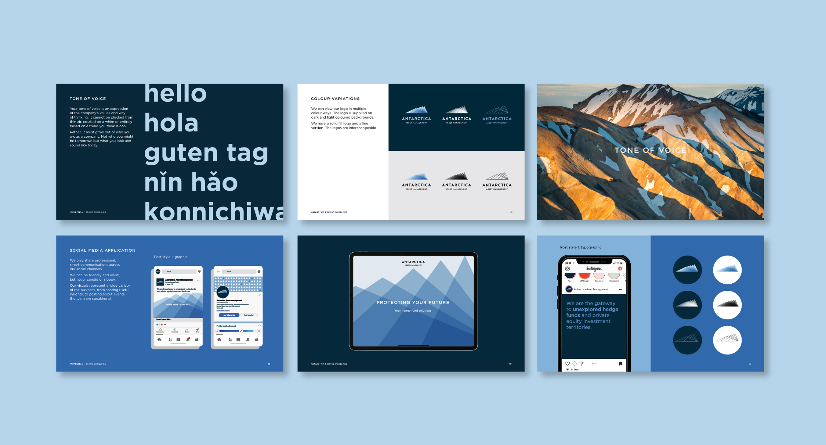
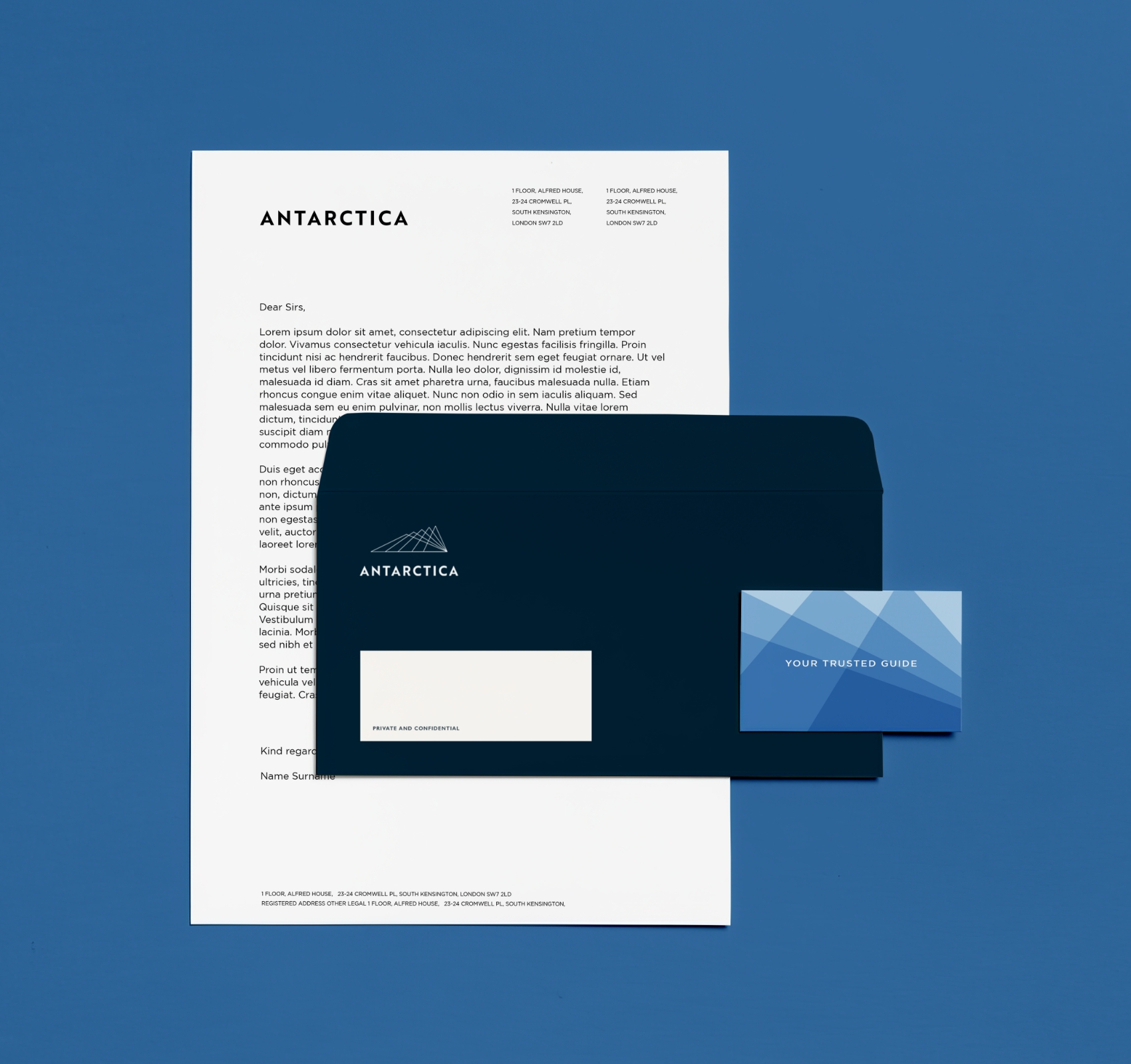
The solution was a new identity formed of multiple triangles, all pointing back to one point – the pinnacle – the guiding light. The overlap of each triangle and layering of colour is then introduced to convey the depth of knowledge and insight that the Antarctica team have and the sharp, clean lines of the marque and typography mirror the ‘on the ball’ nature of the team.
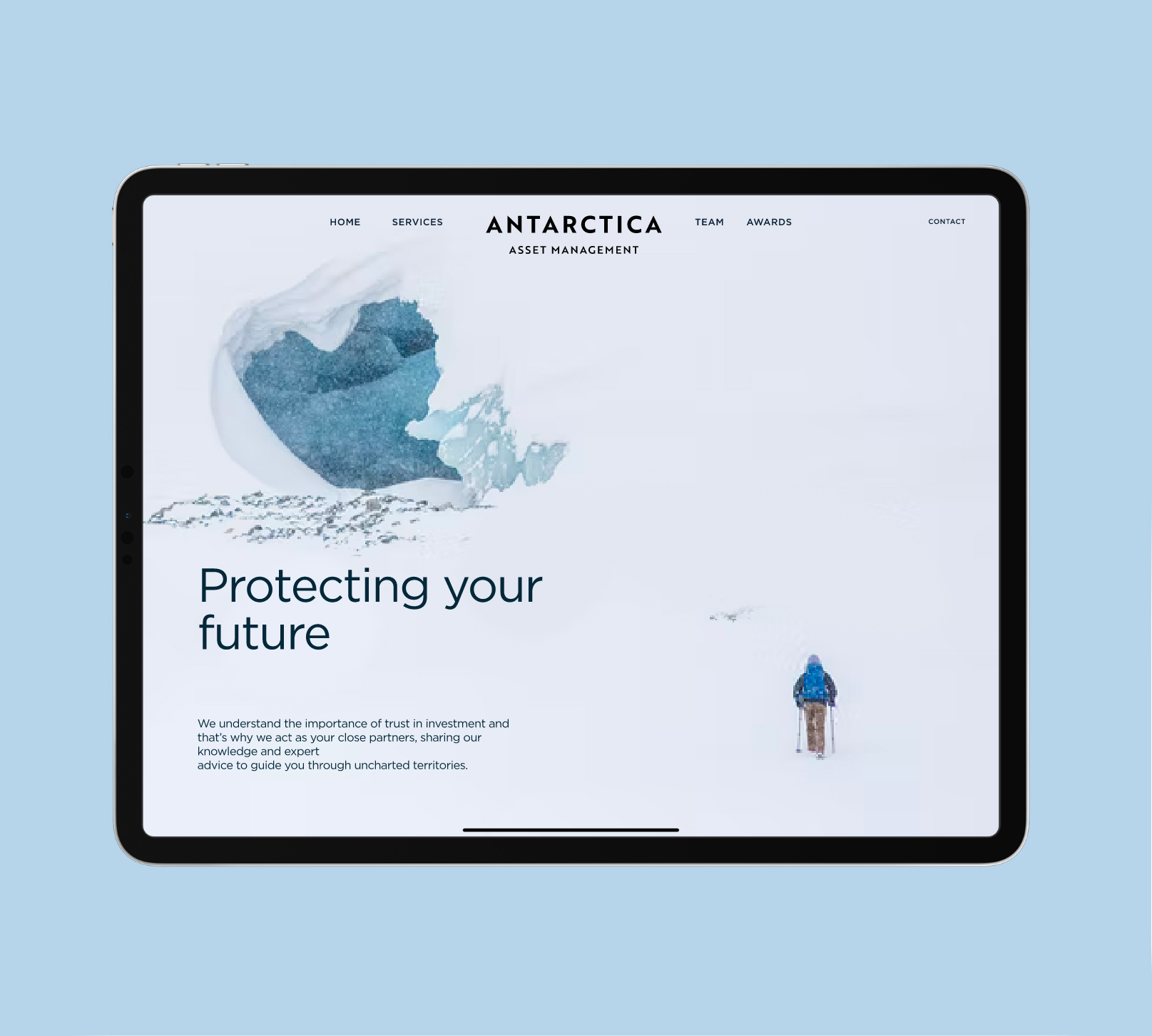
It was also important to keep rooted in the theme of ‘Antarctica explorers’, guiding their clients through uncharted terrain, so the range of blues was inspired by the colours of Antarctica, and concise messaging repositions Antarctica as the gateway to unexplored hedge funds and private equity investment territories.
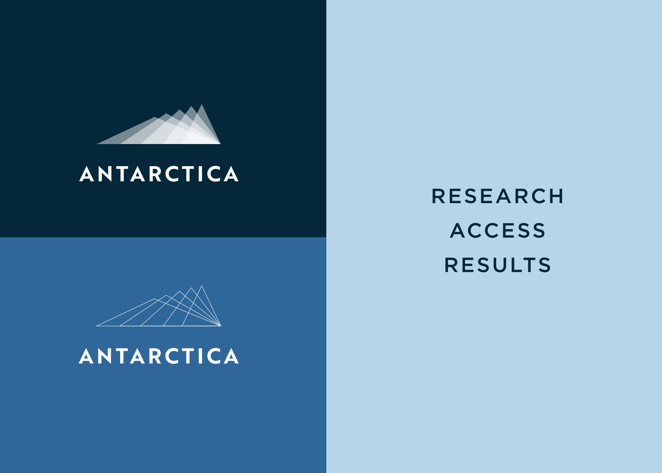
We created multiple triangles, all pointing back to one point as the guiding light.
assets under management with continued growth
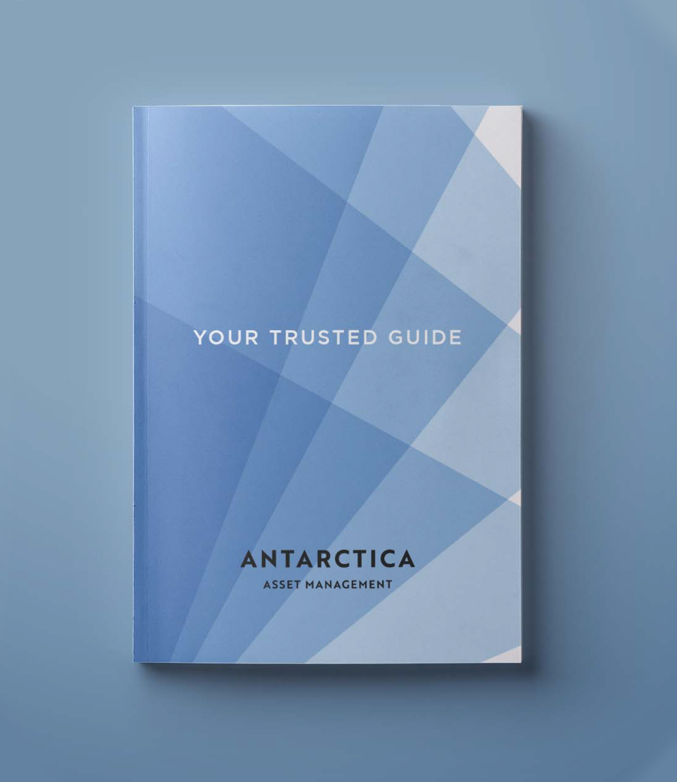
The layering of colour was introduced to convey their depth of knowledge and insight.

Allocators, Institutional Investors, Private Banks, Wealth Managers, Family Offices & High Networth Individuals.

We really appreciate the finished brand and seeing how it all works for our company.
